Art and Parcel
Scope: Brandmark, Logotype
Skills: Illustration, Typography
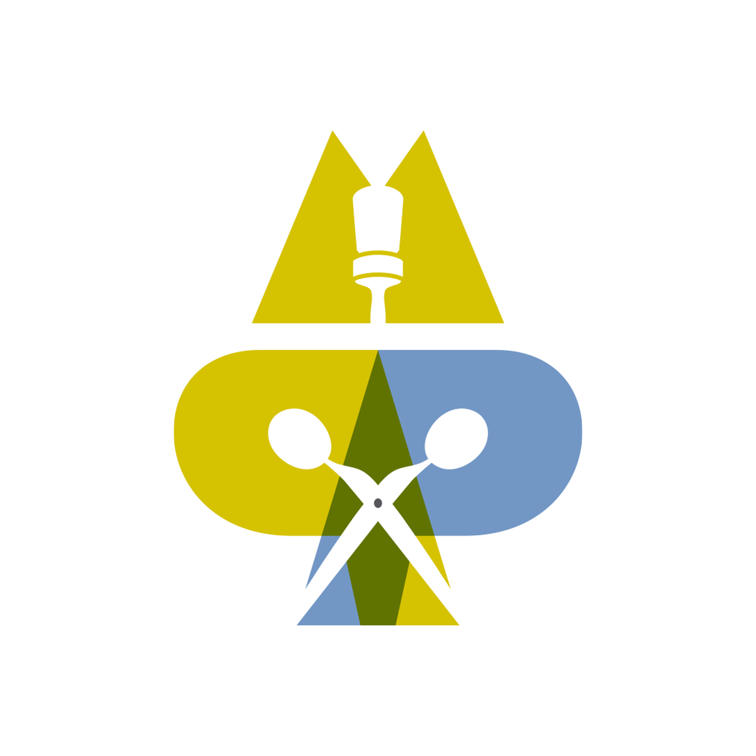
Former branding which merged my initials, “MP”, and brand name, “art & parcel.” My goal was to suggest the idiom “part & parcel” (something integral with a whole). Art and design cannot be separated from my life; it is the way I see, process and express the world.
My initials, brand name and avatar are integrated as a whole through interaction of color, form and type. The letterforms which make up the avatar, “M”, back-to-back “P”s, and “A”, also incorporate the visual pun “cut and paste” in the form of a paste brush and a pair of scissors. Both a digital and physical action it represents the balance I strive to achieve between hand building skills and digital prowess.
A modified Clarendon typeface creates the logotype. By adjusting the weights and curves, removing the serifs, and retaining the ball terminals the result is a sleek logotype with character.
Cell Culture Cafe
Scope: Brandmark, Logotype
Skills: Illustration, Typography
Client: Thermo Fisher Scientific
Agency: Somnio
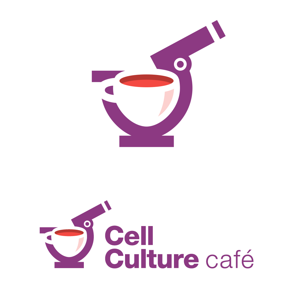
The Cell Culture Cafe is a science-based community where techniques, tips and questions concerning cell culture are presented and discussed through a series of webinars.
In this logo the petri dish and coffee mug merge to create an optical illusion within a magnifying glass.


